Wednesday 27 October 2010

Location Shots.


These are pictures that I took and this is the area in which I will at a later point film. I think it suits my genre as it looks spooky, it is also out of the way from other people, this is good as they could get in the way and make my filming harder.

Actors.

Even though my original plot stated that I would use a group of friends, instead in my second plot (which I have chosen to go for) states that the plot had changed and that there was now only 2 characters, these two characters are shown below:
Benjamin Murphy and Oliver Smith, Oliver will play the victim and Ben will play the murderer. There were other choices for these roles but these two looked to be the best options to play the parts.

Friday 22 October 2010

Animatic

This is my animatac, this shows where the shots that I have taken will fit into the trailer and the effects that go with them. I have also placed in the two soundtracks that I will use in my trailer as well, however my trailer will be double the length of this animatic so the soundtracks will fit in much better. I have also put in my title and the slogan which will be around those positions in the trailer, I may also add in a few more captions throughout the trailer as I feel this will have a greater effect on the audience.

Example of an Animatic.


This is an example of an animatic by the band 'Gorillaz' this animatic shows the different images that will be used in their final video. This is an excellent animatic due to the amount of detail it reaches, which you expect from Gorillaz because a member of their band is by trade a comic book illustrator. Each of the pictures link together with one another and they all tell a story, which makes it really effective. The song in the background also supports the images as the song lyrics link to what is happening in the song. Doing an animatic could show me if my title and font actually work on screen or whether I have to change them.

Below is the finished video, you can see that parts have been cut out and others added in, but generally the animatic and storyboard is what you see in the final video.

Logo

For my logo on the animatic I created this:


Looking back I really don't like the logo, at all and I don't think it fits with the genre in the slightest, I also think it looks tacky and very rushed. Because of this I am going to create a new logo for my film, which will look more professional and better suited to the horror genre. As you can see I did try and make it link to theme with the use of black and red, but overall I don't think it is eye-catching and doesn't work as a logo, so I will be creating a new logo later on.

Storyboard


This is my storyboard for my film. There are 12 sections to it, as explained in my second plot, because of my research for the storyboard I thought that I would add in the volume of the soundtrack in the background, this is shown on each of the pictures with a music note, which varies in size depending on the volume, this shows where tension will be built and when something has just happened. The first and second pictures show the scientist searching for biology and basically they set the scene, like establishing shots. Number 3 shows that someone was watching him as rocks fall from above him and the villain runs away. The 4th confirms that he is being watched, from above. Number 5 shows him being chased by the villain, on this shot the music will be the loudest and have the largest tempo. Number 6 shows his camera fuzzy, as the scientist is holding a camera and reporting back (like a documentary). The 7th shows him being dragged away and 8 shows where to, (a garage). Numbers 9 and 10 show him strapped to a chair and the tools that the villain will use for torture, the 11th shows that he is dead and the final image shows the police that have come for the villain, who consequently shoots himself.

Plot 2.

Because of different reasons I decided to change the plot of my trailer:

1. Scientist searching for new biology, whilst doing a documentary.
2. Finds something and bends down to look.
3. Whilst down some rocks fall from above and the villain runs away unnoticed.
4. He carries on walking down the path, whilst still being watched from above.
5. He notices the villain and runs but is eventually caught and knocked out.
6. He is dragged away and taken to a rural garage.
7. The villain begins to torture him with obscure weapons.
8. He is eventually killed by all of this horror.
9. Police arrive and the killers shoots himself.

Thursday 21 October 2010

Fonts.

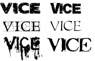
These are my ideas for the chosen font 'Vice'.


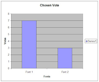
My favourite is the one in the top left corner, this is because it looks effective and will suit my genre of film, I also like the one in the top right as well, just not as much as the other one, the one in the top left is called 'blood sugar'. Because I like one nearly as the other I asked 10 people what was their favourite one. I only conducted the test on the top two though because I will definitely use one of them two.


I have decided that I will use font 1 for my title and font 2 for my slogan as I like both of the font styles.