In this commentary I will explain the different shots that I have used in my trailer. I will also put this commentary into my trailer.
I have created my own logo and used the existing 'green screen' to give my product a more professional look.
The first shot that I have used is a close up, as well as an establishing shot, this shows the area that I have filmed in as well as the main characters face. This was also enhanced by the main character talking about the area in which he was studying.
Next comes the font of 'It was just an ordinary day', this caption is trying to make the audience know that shomething is going to happen.
The next shot again shows him talking about the area and then shows the rock falling next to him, which creates a sense of danger.
After this there is a caption that says 'Does it ever feel like your'e being watched', again this creates more tension.
The next shot is from the killers point of view, hense it being in black and white rather than colour.
It then switches back to the victims point of view at the same place.
Then the next caption comes up saying 'Or you know you are', this still builds tension.
The next shot goes back to Oliver, now looking round as he is worried.
And then once more it reverts back to the killers view, again to show he is still being watched.
The next shot shows Oliver turning round and noticing the killer and then running away this shot is taken from the killers point of view.
The next thing to come up is my title and then it changes back to the killer pulling the victim away.
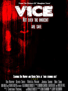
Then the slogan comes up at the end 'not even the innocent are safe' this somes up the trailer.
Then the final shot is that of the 'coming soon' to finish the trailer off.
Thursday, 24 March 2011
Wednesday, 16 March 2011
Tuesday, 15 March 2011
Magazine Cover Final Draft.
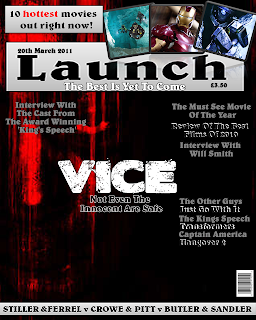
This is my final draft for my front cover, as you can see there is one major change, this being a change in the image used.
Magazine Cover Draft 2
This is the second draft for my magazine front cover, as you can see the image is the same, the only differences are the colours and the positioning of the fonts as well as the size of the image.
Sunday, 13 March 2011
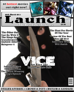
Magazine Cover Draft 1.

This my first draft for my magazine cover. I think that it works quite well other than the main image which doesn't work. For my final draft I will take a new picture that is better suited to the theme and that works better on the cover as this image looks out of place. Other than that I think that it works well and looks quite professional. I have created a shadow between the fonts which makes the fonts stand out much more than it would usually. Along with different effects that I have used to enhance the images used, again to make it stand out and be eye-catching. On the next draft I will also change the background colour and style as this was only the canvas.
Friday, 11 March 2011
Movie Trailer Draft 1
This is the first draft for my trailer, at the moment the editing is quite simple and could be improved with my other ideas, such as images flashing on and off at the end but this is only the first draft. The soundtrack could also be changed to something that suits the genre better but again this is the first draft.
Untitled from Christian Percival on Vimeo.
Final Poster.
After more feedback I have decided to make some other changes to my poster, the feedback that I got was that the pain, torture and death writings didn't look right and that I should change them, as well as the white gap in the poster, I was told that this should be removed because it doesn't suit the genre. I also decided to add in the people who took part at the bottom of the poster, this gives it a more professional feel and is quite conventional.
Final Logo
I have decided to change it from CP Studies to Canyon Pictures, this is because I think this name works better in creating a more professional look.
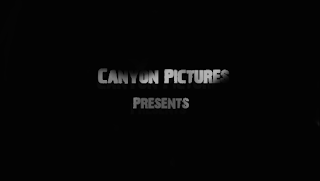
Here is my company logo that will be placed at the start of the film trailer, this is my second logo as I didn't like the first logo that I produced. I think my new logo suits the theme better and does look more professional, as it is very simple.
I have edited this by making the words slightly darker with shadows on, also if you look closely there is a darker version of the words slightly further behind the original title.
Subscribe to:
Comments (Atom)