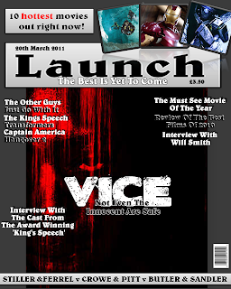
This my first draft for my magazine cover. I think that it works quite well other than the main image which doesn't work. For my final draft I will take a new picture that is better suited to the theme and that works better on the cover as this image looks out of place. Other than that I think that it works well and looks quite professional. I have created a shadow between the fonts which makes the fonts stand out much more than it would usually. Along with different effects that I have used to enhance the images used, again to make it stand out and be eye-catching. On the next draft I will also change the background colour and style as this was only the canvas.
No comments:
Post a Comment