Saturday, 27 November 2010
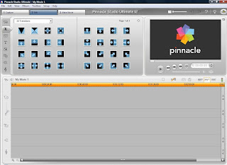
Pinnacle

Wednesday, 27 October 2010
Location Shots.
Actors.
Friday, 22 October 2010
Animatic
This is my animatac, this shows where the shots that I have taken will fit into the trailer and the effects that go with them. I have also placed in the two soundtracks that I will use in my trailer as well, however my trailer will be double the length of this animatic so the soundtracks will fit in much better. I have also put in my title and the slogan which will be around those positions in the trailer, I may also add in a few more captions throughout the trailer as I feel this will have a greater effect on the audience.
Example of an Animatic.
This is an example of an animatic by the band 'Gorillaz' this animatic shows the different images that will be used in their final video. This is an excellent animatic due to the amount of detail it reaches, which you expect from Gorillaz because a member of their band is by trade a comic book illustrator. Each of the pictures link together with one another and they all tell a story, which makes it really effective. The song in the background also supports the images as the song lyrics link to what is happening in the song. Doing an animatic could show me if my title and font actually work on screen or whether I have to change them.
Below is the finished video, you can see that parts have been cut out and others added in, but generally the animatic and storyboard is what you see in the final video.
Logo
Storyboard


Plot 2.
Thursday, 21 October 2010
Fonts.
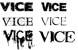
My favourite is the one in the top left corner, this is because it looks effective and will suit my genre of film, I also like the one in the top right as well, just not as much as the other one, the one in the top left is called 'blood sugar'. Because I like one nearly as the other I asked 10 people what was their favourite one. I only conducted the test on the top two though because I will definitely use one of them two.
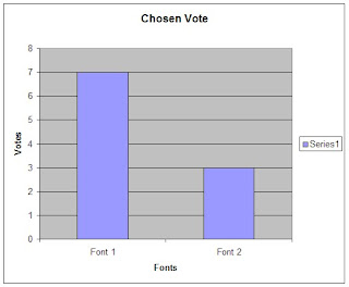
I have decided that I will use font 1 for my title and font 2 for my slogan as I like both of the font styles.
Thursday, 30 September 2010
Slogan.
1. Not even the innocent are safe.
2. Yesterday was your last day alive.
3. Welcome to hell.
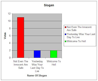
To decide on which slogan to have I carried out some feedback from different people, I already know my favourite slogan and I want to see if anyone else agrees.
Becky Mahan
I really like number 1 because I think that it links in well with the genre that he has chosen. I think that it is short and snappy and will catch the audiences eyes well if the colour and font are chosen well.
Nick
Number 1 is by far my favourite as it sounds a very good slogan, it is catchy and it links to the theme of the film.
Ben
The first of the slogans is my favourite because it supports the the title and the genre of the film, my least favourite is Welcome To Hell, for the simple reason that it seems a bit simple and doesn't relate to the film as well as the others.
Overall I asked 15 people to rate my slogans and placed the results in the table shown below.
Movie Titles.
2. Slaughter Town.
3. Not Even The Innocent Are Safe.
4. Corrupt.
5. Vice.
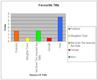
These are the 5 titles that I have chosen and will now conduct feedback to find which is the most popular name.
Becky Mahan
I like number 2 the best because i think that it represents the genre very well. I also think that it is the best one out of the 5 because it sounds mysterious and intriguing. I don't like number 5 because I don't think it fits with the genre.
Nick
My favourite is number 5 because it sounds like a horror film and the name is quite catchy, I also like number 3 as it also sounds catchy, my least favourite is number 2 because it doesn't sound authentic.
Ben
I like number 1, 4 and 5 equally, simply because they are one word, which will appeal to the audience. Number 3 is also good but it sounds more like a slogan or a catchphrase rather than a title for a film, my least favourite is Slaughter town because it sounds a bit childish.
Overall I asked 15 people of their opinions and placed the results in a table.
Basic Plot Summary.
2. One notices that someone has been following them for a while.
3. They decide to run, fearing the worst. The person still just walks.
4. They think they loose him but they dint. Its as if there is more than one thing after them.
5. Only one friend gets away, who immediately notifies the police and family.
6. Each of them fear the worst as they are tied up in the back of the truck.
7. They are taken to a garage far away in a baron deserted area.
8. Each of them have tape strapped over there mouths and are each strapped down to chairs.
9. The creatures then begin to commit horrid offenses to these friends with different tools.
10. They friends hold on to their lives in hope that they will be saved.
11. Police then arrive with the other boy and attempt to kill this or these men.
12. The other boy is then taken hostage by one of the other creatures, who threatens the police with his and the others death.
13. One of the other boys notices a tool left next to him and throws it at one of the men.
14. The police storm in and quickly kill the 3 men inside.
15. No-one notices that there was another maniac who was now stood behind them who begins to spray bullets at everyone and then at himself killing more innocent police in the process.
16. Boys taken back home to parents.
Ideas For Magazine Cover
Ideas For Poster
Ideas For Trailer
Paranormal Activity Trailer.
This is the Paranormal Activity trailer, I have used this because of the different effects within the trailer. The thing that I like most about this trailer is the way that it creates a sense of fear easily. The other key technique used in the this trailer is the fact that it is constantly dark, at no point is there any sign of lightness, which really gives the viewer a sense of the film and of the horror. Again like most trailers it uses a mixture of quick and longer cuts, which suits the genre perfectly.
28 Days Later Trailer.
This trailer also shows different techniques that I could use in my trailer. One of the things I really like about this trailer is that of the fonts. I like the amount of times the font is used at the start of the trailer and the effect it has. This technique is one that I will try and use in my own trailer because it emphasizes the theme of horror for the trailer. I also like the use of quick and long cuts and how they are both used equally, they both have great effects and create the sense of horror.
Sunday, 26 September 2010
Sunday, 19 September 2010
Wolf Creek Trailer.
This is one of the trailers from the film 'Wolf Creek', which is a horror film. I chose to analyse this film because of the different and interesting techniques used in the trailer throughout. The first technique that I may try and duplicate is that of the switch of themes, the first half of the trailer was happy and relaxed, with the sun out and people having a good time, but as soon as it becomes night it all changes showing a quick change of the theme. I like this effect as it shows contrast which I want in my trailer. Another technique I liked was towards the end when the scenes moved much quicker than at the start, showing that they are in great danger and are scared for their lives, this is shown by the frantic soundtrack (compared to the quite, peaceful soundtrack at the start) and the transition of the trailer. Again this is a technique I would use in the second half of the trailer to again show that there are two sides to the film. At the end of the trailer the title of the film comes up, and just after that it shows a slogan and one more clip, this will be very similar to my ending as I think it is really effective to leave the audience clipped to the trailer with a slogan that will shock them, as it does it this trailer.
Tuesday, 6 July 2010
Halloween II Trailer
This is the Halloween trailer, I have chosen to research this because of its genre and the many different techniques that would be useful to include in my own trailer, it starts with someone in the distance at night, this creates a real sense of eeriness as we don't know who this person is. You then see a closer view of this person with a gun in her hand and she is also looking a real mess, as though she has been chased or injured, which is electrified with the police man coming to see how she is, this shows that there is something wrong. You then see many more people in great pain and danger, again it creates suspense as we don't know why or how. The empty hospital is used to show that the woman is alone and in great danger still. You then finally see the killer, and then the soundtrack really kicks in as she hobbles away, the killers face is still dark, to show evil and we still don't know who it is. Another clever technique that I like is when the woman looks in the mirror and then sees the reflection of the killer in the mirror and then screams. Then the woman runs away and this starts the soundtrack again, another useful technique, finally the font style and colours, they are red and suit a horror film which is another good technique that I will use, this is a very useful trailer for research and will be helpful in creating my trailer.
Tuesday, 29 June 2010
Saw VI Trailer.
This is the Saw VI trailer, I have chosen to research this trailer because it is of the genre that I have chosen and has some useful techniques, such as the camera moving backwards throughout to show the scene, which is also common to the Halloween trailer. Also it constantly shows people in pain for a very shot period of time, showing their facial expressions and items of torture, this creates a great deal of suspense. There is also a constant soundtrack to increase the tension and it also shows the genre of the film. The fonts used are constant throughout which shows consistency and most of the fonts include the number 6, which links to the title of the films, this is a clever technique and one which I would try and replicate if possible.
Monday, 28 June 2010
Research and Genres.
Thriller films I could look at include: The Godfather, Shifty and The Dark Knight.
Horror films I could look at include: The Saw collection, Scream, Halloween, ect..
With these films I will also need to find a suitable soundtrack for parts of the trailer to create suspense and enhance the trailer, I will use Garage bands to find different artists within which would suit the genre of the film that I choose to take forward.
As I go through the project I will find different trailers that suit what I want to do in my trailer, and I will research them as well as these listed here. I also intend to use YouTube to find different amateur movie trailers for other students that have done movie trailers for their A level, I think this would be very useful to see different techniques used that are accessible.
Wednesday, 23 June 2010
Wordle
Monday, 21 June 2010
Schedule
- Complete research (existing products/audience) by 24th July.
- Complete planning (scripts, shot lists, storyboards, animatics, mock-ups and flat plans ect..) by 10th September.
- Complete rough-cut by 20th September.
- Complete final-cut by 1st October.
- Complete album/poster completed by 15th October.
- Final album/poster completed by 31st October.
- Audience feedback by 10th November.
- Revisions by 20th November.
- Evaluations by 30th November.
- 1st hand-in 1st December.


