Sunday 6 February 2011

Magazine Cover Layout.

From all of my research I have picked the layout that I will use, it will have a mixture of the different techniques used in their magazine covers.


As you can see I have used the research to find that the main image is key, hence why I have used the technique that they used, with it being much larger than the rest of the things on the front cover. I have overlapped things but only slightly, and I have also included other key information around the cover as used in 'Total Film' as well as the 3 pictures in the top right which is a technique I really like.

Magazine Title.

Firstly I have to create my title for the magazine. The name will be hopefully catchy and will only be 1 word as more than word generally doesn't work.

These are the names that I have come up with so far:
  1. Launch.

  2. Trademark.

  3. Crash.

  4. Killer.

  5. Remedy.

These are the 5 names that I have come up with, I will now get feedback to see which people like, if any at all and any suggestions from them.

Magazine Cover Research 3.


This is a magazine cover by 'Empire', as with 'Total Films' magazine cover the message is very clear from the start and this is again due to the very striking image that takes up the whole page. It also shows, as with Total Film, the lesser articles to the sides of the main image, showing that the main image is the most important and that nothing should cover it up, which is backed up by the barcode being to the side of the cover. Again the name of the magazine is in huge writing as that is just as important as the main image, and only the main image will cover the title up.

Magazine Cover Research 2,


This is another example of a magazine cover by 'Total Film', as with the last post this cover immediately shows the viewer the main contents of the magazine, 'Sherlock Holmes', again this is done with the huge lettering and again the colour scheme, which I have noticed is consistent throughout their products. As with the last magazine I looked out the positioning of the Title and the main articles are the same, or at least very similar, this shows continuity throughout the products. Another similarity from the other cover is that the other stories are in the same areas, to the side of the main striking image which takes you attention. Its obvious that a good magazine cover is all about the 1 main image which will grab the attention of the reader. A technique that I will use is that of the 3 picture slots in the top right of this page, I think this is a really useful technique of showing the audience what is in the magazine without too much detail.

Magazine Cover Research 1.

For me to do this I have done some research towards the cover, this is so I can get the layout correct and also see any common techniques in the magazine covers.


The is the magazine cover for the magazine 'Total Film' and it is obviously showing Valkyrie as the main headliner film. You notice this immediately and this is due to it standing out and being extremely large and in your face. The colour also stands out from the rest, as the other fonts are in white, or if not they are smaller, this magazine makes the star film the main headline to entice the audience into buying. Like my poster it uses one main image, and then places what else is in the issue around the image, so it dosent take any glory away from the main aim of this issue, 'Valkyrie'. The techniques used in this magazine are certainly ones I would want to use in my own magazine cover.

Final Draft for Poster.


This is my final draft for my poster, as you can see I have taken into my feedback into consideration, I have done this by changing my stars to something that suits the genre a little better. I have also added in the last few key lines such as the actors and previous films to make it feel more like a movie poster. Additionally I have added a dark red glow around the title and slogan, again this fits with the colour scheme and genre and makes it a little more believable. One thing I didn't like about this poster in an earlier draft was the space in the middle at the bottom, and I couldn't find anything to fit it, however I have now found an image which fits perfectly and again links to the trailer and the genre. Finally I have deleted the red boxes around the words, this is because I felt it made it look unprofessional. I will make any improvements at a later time if needed.

Feedback For Poster,

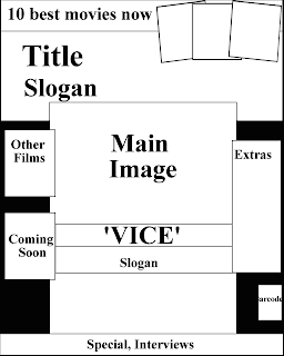
To find which of my poster drafts I would take forward I carried out some feedback. The results of this feedback are key as it is from the target audience. The results of the feedback are as follows:

Rebecca Mahan:
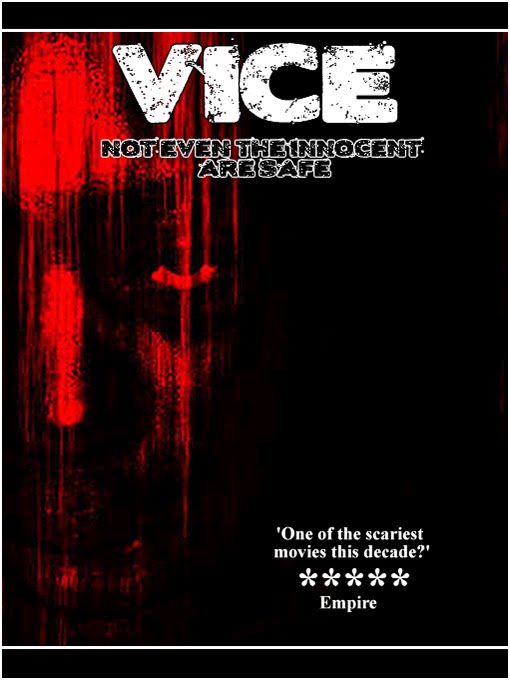
I like the 3rd poster the best, this is due to colours and the writing by the side of the image. To improve I would change the 'vice' at the bottom, its colour and maybe a different word, or image there all together. I also don't like the stars used, this is because they are too big and don't fit the horror theme that is being portrayed.

Immediately this feedback has helped, this is because it has confirmed the problems that I noticed with the poster and it also showed me other ways to improve, that I hadn't originally noticed.

I then asked my parents for some feedback to see what they thought of the poster, if they had the same problems as Rebecca then I know that I have to change this things.

Parents:
The 3rd poster is the best, because the images in the 4th draft dont fit the theme, even though they are meant to. This is because they change the colour scheme and make it seem lighter than it should. The problem with the 3rd poster is the stars as again, they make it seem lighter, this could be because of the font used. However the main strength is the image used as it portrays horror quite well.

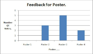
Again this shows me the problems and they were generally the same as what Rebecca noticed. I now have a clear direction how to improve my poster. I then put the rest of the results into a graph to show that the favourite design was the 3rd draft, what was surprising was the fact that 3 people liked the 2nd draft, which was quite plain.


Saturday 5 February 2011

4th Draft For Poster.


This is my final design for my poster, this draft again has the space filled with images and fonts. I have also tried to mainly stick with a colour scheme of red, other than key areas that stand out. I have done this to make it feel quite a dark poster, which is always the aim of a horror film. The feedback that I now find will help me decide the best out of these posters. In my opinion, I think that my 3rd draft is the better of my drafts, this is because I think all the colours work better with the theme, rather than the images used in this draft. However the final decision comes from the target audience.

3rd Draft Of Poster.


This is my 3rd draft, as you can see I have stuck to the plan shown in the previous post, the words I have placed into this poster fill all the spaces and make it seem more professional. I am now going to try 1 more draft with images in those spaces and see what the outcome of that is. At the end I am going to ask people for their chosen poster, hopefully it will be one of the latter two because they are the improved versions and the ones that I believe are the best. This is my favourite design as the colours work well together. However if I do pick this as my design I would still make a few changes, as this is only a draft copy, for my final copy I would change the wording at the bottom, where it says vice and also change the font colour.

3rd Draft Idea For Poster.


This is the 3rd draft idea for my poster, this draft shows the positions in which the images could be placed, originally I was only going to have 1 more image, and that was to fill the gap at the bottom in between the 'reviews'. However from feedback, I noticed that the target audience still felt that the poster was still a little empty, so I've decided, (depending on the images) to add to more slots where an image could be placed, which would fill the gaps and make the poster eye-catching, which is the main aim. This will be extremely similar to my magazine cover as the layout of the magazine will be the same as this poster, obviously my film name wont be the main title on the page, so that and the slogan will be moved. The image slots will be used to show images from either my film trailer or from others within the magazine. As with the review spaces at the bottom which could be used for many other things.

2nd Draft Of Poster.


This plays along the similar lines as the first poster, but in my opinion has improved. To me this poster looks far more professional because of the layout and the colour schemes. I have improved the colours of the fonts by making them a darker red, to help show a theme of blood and horror. Even though there is still quite a large gap, it does feel more like a poster, although it is still missing something. I still think and will find out with my feedback that need something extra, to fill one of the missing spaces and maybe a slight change of colours of the slogan but that will be debated.

1st Draft Of Poster.


This is my first draft for my poster, which will also be very similar; if not the same as my magazine cover. This is a basic draft, but still holds my key image, which I find very striking, hence why it is the only image on the poster. I also think that my poster links well to the horror theme due to the colour scheme and the fonts. I will ask people for feedback to help improve my poster as the target audience know better as it is what they want to see. Improvements can be made to this poster as it is only a first draft. There is still space on the right of this poster where other images or writing can be placed.