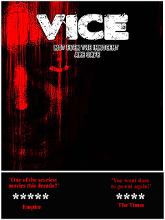
This plays along the similar lines as the first poster, but in my opinion has improved. To me this poster looks far more professional because of the layout and the colour schemes. I have improved the colours of the fonts by making them a darker red, to help show a theme of blood and horror. Even though there is still quite a large gap, it does feel more like a poster, although it is still missing something. I still think and will find out with my feedback that need something extra, to fill one of the missing spaces and maybe a slight change of colours of the slogan but that will be debated.
No comments:
Post a Comment