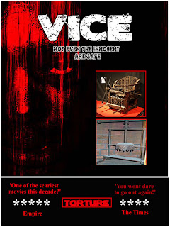
This is my final design for my poster, this draft again has the space filled with images and fonts. I have also tried to mainly stick with a colour scheme of red, other than key areas that stand out. I have done this to make it feel quite a dark poster, which is always the aim of a horror film. The feedback that I now find will help me decide the best out of these posters. In my opinion, I think that my 3rd draft is the better of my drafts, this is because I think all the colours work better with the theme, rather than the images used in this draft. However the final decision comes from the target audience.
No comments:
Post a Comment