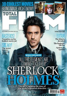
This is another example of a magazine cover by 'Total Film', as with the last post this cover immediately shows the viewer the main contents of the magazine, 'Sherlock Holmes', again this is done with the huge lettering and again the colour scheme, which I have noticed is consistent throughout their products. As with the last magazine I looked out the positioning of the Title and the main articles are the same, or at least very similar, this shows continuity throughout the products. Another similarity from the other cover is that the other stories are in the same areas, to the side of the main striking image which takes you attention. Its obvious that a good magazine cover is all about the 1 main image which will grab the attention of the reader. A technique that I will use is that of the 3 picture slots in the top right of this page, I think this is a really useful technique of showing the audience what is in the magazine without too much detail.
No comments:
Post a Comment