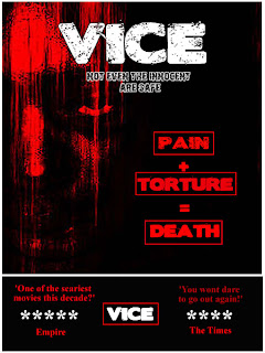
This is my 3rd draft, as you can see I have stuck to the plan shown in the previous post, the words I have placed into this poster fill all the spaces and make it seem more professional. I am now going to try 1 more draft with images in those spaces and see what the outcome of that is. At the end I am going to ask people for their chosen poster, hopefully it will be one of the latter two because they are the improved versions and the ones that I believe are the best. This is my favourite design as the colours work well together. However if I do pick this as my design I would still make a few changes, as this is only a draft copy, for my final copy I would change the wording at the bottom, where it says vice and also change the font colour.
No comments:
Post a Comment