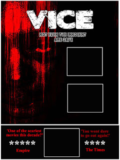
This is the 3rd draft idea for my poster, this draft shows the positions in which the images could be placed, originally I was only going to have 1 more image, and that was to fill the gap at the bottom in between the 'reviews'. However from feedback, I noticed that the target audience still felt that the poster was still a little empty, so I've decided, (depending on the images) to add to more slots where an image could be placed, which would fill the gaps and make the poster eye-catching, which is the main aim. This will be extremely similar to my magazine cover as the layout of the magazine will be the same as this poster, obviously my film name wont be the main title on the page, so that and the slogan will be moved. The image slots will be used to show images from either my film trailer or from others within the magazine. As with the review spaces at the bottom which could be used for many other things.
No comments:
Post a Comment