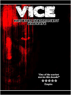
This is my first draft for my poster, which will also be very similar; if not the same as my magazine cover. This is a basic draft, but still holds my key image, which I find very striking, hence why it is the only image on the poster. I also think that my poster links well to the horror theme due to the colour scheme and the fonts. I will ask people for feedback to help improve my poster as the target audience know better as it is what they want to see. Improvements can be made to this poster as it is only a first draft. There is still space on the right of this poster where other images or writing can be placed.
No comments:
Post a Comment