Rebecca Mahan:
I like the 3rd poster the best, this is due to colours and the writing by the side of the image. To improve I would change the 'vice' at the bottom, its colour and maybe a different word, or image there all together. I also don't like the stars used, this is because they are too big and don't fit the horror theme that is being portrayed.
Immediately this feedback has helped, this is because it has confirmed the problems that I noticed with the poster and it also showed me other ways to improve, that I hadn't originally noticed.
I then asked my parents for some feedback to see what they thought of the poster, if they had the same problems as Rebecca then I know that I have to change this things.
Parents:
The 3rd poster is the best, because the images in the 4th draft dont fit the theme, even though they are meant to. This is because they change the colour scheme and make it seem lighter than it should. The problem with the 3rd poster is the stars as again, they make it seem lighter, this could be because of the font used. However the main strength is the image used as it portrays horror quite well.
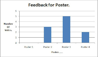
Again this shows me the problems and they were generally the same as what Rebecca noticed. I now have a clear direction how to improve my poster. I then put the rest of the results into a graph to show that the favourite design was the 3rd draft, what was surprising was the fact that 3 people liked the 2nd draft, which was quite plain.

No comments:
Post a Comment