In this commentary I will explain the different shots that I have used in my trailer. I will also put this commentary into my trailer.
I have created my own logo and used the existing 'green screen' to give my product a more professional look.
The first shot that I have used is a close up, as well as an establishing shot, this shows the area that I have filmed in as well as the main characters face. This was also enhanced by the main character talking about the area in which he was studying.
Next comes the font of 'It was just an ordinary day', this caption is trying to make the audience know that shomething is going to happen.
The next shot again shows him talking about the area and then shows the rock falling next to him, which creates a sense of danger.
After this there is a caption that says 'Does it ever feel like your'e being watched', again this creates more tension.
The next shot is from the killers point of view, hense it being in black and white rather than colour.
It then switches back to the victims point of view at the same place.
Then the next caption comes up saying 'Or you know you are', this still builds tension.
The next shot goes back to Oliver, now looking round as he is worried.
And then once more it reverts back to the killers view, again to show he is still being watched.
The next shot shows Oliver turning round and noticing the killer and then running away this shot is taken from the killers point of view.
The next thing to come up is my title and then it changes back to the killer pulling the victim away.
Then the slogan comes up at the end 'not even the innocent are safe' this somes up the trailer.
Then the final shot is that of the 'coming soon' to finish the trailer off.
Thursday, 24 March 2011
Wednesday, 16 March 2011
Tuesday, 15 March 2011
Magazine Cover Final Draft.
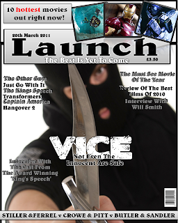
This is my final draft for my front cover, as you can see there is one major change, this being a change in the image used.
Magazine Cover Draft 2
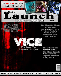
This is the second draft for my magazine front cover, as you can see the image is the same, the only differences are the colours and the positioning of the fonts as well as the size of the image.
Sunday, 13 March 2011
Magazine Cover Draft 1.

This my first draft for my magazine cover. I think that it works quite well other than the main image which doesn't work. For my final draft I will take a new picture that is better suited to the theme and that works better on the cover as this image looks out of place. Other than that I think that it works well and looks quite professional. I have created a shadow between the fonts which makes the fonts stand out much more than it would usually. Along with different effects that I have used to enhance the images used, again to make it stand out and be eye-catching. On the next draft I will also change the background colour and style as this was only the canvas.
Friday, 11 March 2011
Movie Trailer Draft 1
This is the first draft for my trailer, at the moment the editing is quite simple and could be improved with my other ideas, such as images flashing on and off at the end but this is only the first draft. The soundtrack could also be changed to something that suits the genre better but again this is the first draft.
Untitled from Christian Percival on Vimeo.
Final Poster.
After more feedback I have decided to make some other changes to my poster, the feedback that I got was that the pain, torture and death writings didn't look right and that I should change them, as well as the white gap in the poster, I was told that this should be removed because it doesn't suit the genre. I also decided to add in the people who took part at the bottom of the poster, this gives it a more professional feel and is quite conventional.
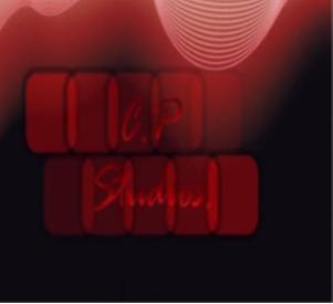
Final Logo
I have decided to change it from CP Studies to Canyon Pictures, this is because I think this name works better in creating a more professional look.
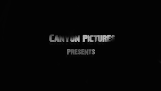
Here is my company logo that will be placed at the start of the film trailer, this is my second logo as I didn't like the first logo that I produced. I think my new logo suits the theme better and does look more professional, as it is very simple.
I have edited this by making the words slightly darker with shadows on, also if you look closely there is a darker version of the words slightly further behind the original title.
Sunday, 6 February 2011
Magazine Cover Layout.
From all of my research I have picked the layout that I will use, it will have a mixture of the different techniques used in their magazine covers.
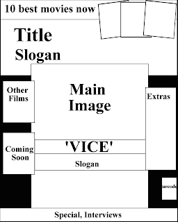
As you can see I have used the research to find that the main image is key, hence why I have used the technique that they used, with it being much larger than the rest of the things on the front cover. I have overlapped things but only slightly, and I have also included other key information around the cover as used in 'Total Film' as well as the 3 pictures in the top right which is a technique I really like.
Magazine Title.
Firstly I have to create my title for the magazine. The name will be hopefully catchy and will only be 1 word as more than word generally doesn't work.

These are the names that I have come up with so far:
- Launch.
- Trademark.
- Crash.
- Killer.
- Remedy.
These are the 5 names that I have come up with, I will now get feedback to see which people like, if any at all and any suggestions from them.

Magazine Cover Research 3.

This is a magazine cover by 'Empire', as with 'Total Films' magazine cover the message is very clear from the start and this is again due to the very striking image that takes up the whole page. It also shows, as with Total Film, the lesser articles to the sides of the main image, showing that the main image is the most important and that nothing should cover it up, which is backed up by the barcode being to the side of the cover. Again the name of the magazine is in huge writing as that is just as important as the main image, and only the main image will cover the title up.
Magazine Cover Research 2,

This is another example of a magazine cover by 'Total Film', as with the last post this cover immediately shows the viewer the main contents of the magazine, 'Sherlock Holmes', again this is done with the huge lettering and again the colour scheme, which I have noticed is consistent throughout their products. As with the last magazine I looked out the positioning of the Title and the main articles are the same, or at least very similar, this shows continuity throughout the products. Another similarity from the other cover is that the other stories are in the same areas, to the side of the main striking image which takes you attention. Its obvious that a good magazine cover is all about the 1 main image which will grab the attention of the reader. A technique that I will use is that of the 3 picture slots in the top right of this page, I think this is a really useful technique of showing the audience what is in the magazine without too much detail.
Magazine Cover Research 1.
For me to do this I have done some research towards the cover, this is so I can get the layout correct and also see any common techniques in the magazine covers.
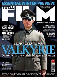
The is the magazine cover for the magazine 'Total Film' and it is obviously showing Valkyrie as the main headliner film. You notice this immediately and this is due to it standing out and being extremely large and in your face. The colour also stands out from the rest, as the other fonts are in white, or if not they are smaller, this magazine makes the star film the main headline to entice the audience into buying. Like my poster it uses one main image, and then places what else is in the issue around the image, so it dosent take any glory away from the main aim of this issue, 'Valkyrie'. The techniques used in this magazine are certainly ones I would want to use in my own magazine cover.
Final Draft for Poster.

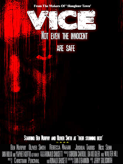
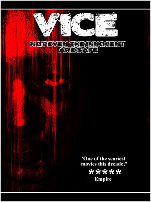
This is my final draft for my poster, as you can see I have taken into my feedback into consideration, I have done this by changing my stars to something that suits the genre a little better. I have also added in the last few key lines such as the actors and previous films to make it feel more like a movie poster. Additionally I have added a dark red glow around the title and slogan, again this fits with the colour scheme and genre and makes it a little more believable. One thing I didn't like about this poster in an earlier draft was the space in the middle at the bottom, and I couldn't find anything to fit it, however I have now found an image which fits perfectly and again links to the trailer and the genre. Finally I have deleted the red boxes around the words, this is because I felt it made it look unprofessional. I will make any improvements at a later time if needed.
Feedback For Poster,
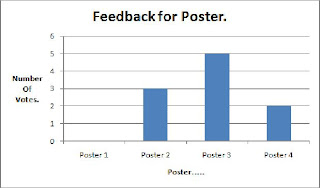
To find which of my poster drafts I would take forward I carried out some feedback. The results of this feedback are key as it is from the target audience. The results of the feedback are as follows:
Rebecca Mahan:
I like the 3rd poster the best, this is due to colours and the writing by the side of the image. To improve I would change the 'vice' at the bottom, its colour and maybe a different word, or image there all together. I also don't like the stars used, this is because they are too big and don't fit the horror theme that is being portrayed.
Immediately this feedback has helped, this is because it has confirmed the problems that I noticed with the poster and it also showed me other ways to improve, that I hadn't originally noticed.
I then asked my parents for some feedback to see what they thought of the poster, if they had the same problems as Rebecca then I know that I have to change this things.
Parents:
The 3rd poster is the best, because the images in the 4th draft dont fit the theme, even though they are meant to. This is because they change the colour scheme and make it seem lighter than it should. The problem with the 3rd poster is the stars as again, they make it seem lighter, this could be because of the font used. However the main strength is the image used as it portrays horror quite well.
Again this shows me the problems and they were generally the same as what Rebecca noticed. I now have a clear direction how to improve my poster. I then put the rest of the results into a graph to show that the favourite design was the 3rd draft, what was surprising was the fact that 3 people liked the 2nd draft, which was quite plain.
Saturday, 5 February 2011
4th Draft For Poster.

This is my final design for my poster, this draft again has the space filled with images and fonts. I have also tried to mainly stick with a colour scheme of red, other than key areas that stand out. I have done this to make it feel quite a dark poster, which is always the aim of a horror film. The feedback that I now find will help me decide the best out of these posters. In my opinion, I think that my 3rd draft is the better of my drafts, this is because I think all the colours work better with the theme, rather than the images used in this draft. However the final decision comes from the target audience.
3rd Draft Of Poster.

This is my 3rd draft, as you can see I have stuck to the plan shown in the previous post, the words I have placed into this poster fill all the spaces and make it seem more professional. I am now going to try 1 more draft with images in those spaces and see what the outcome of that is. At the end I am going to ask people for their chosen poster, hopefully it will be one of the latter two because they are the improved versions and the ones that I believe are the best. This is my favourite design as the colours work well together. However if I do pick this as my design I would still make a few changes, as this is only a draft copy, for my final copy I would change the wording at the bottom, where it says vice and also change the font colour.
3rd Draft Idea For Poster.

This is the 3rd draft idea for my poster, this draft shows the positions in which the images could be placed, originally I was only going to have 1 more image, and that was to fill the gap at the bottom in between the 'reviews'. However from feedback, I noticed that the target audience still felt that the poster was still a little empty, so I've decided, (depending on the images) to add to more slots where an image could be placed, which would fill the gaps and make the poster eye-catching, which is the main aim. This will be extremely similar to my magazine cover as the layout of the magazine will be the same as this poster, obviously my film name wont be the main title on the page, so that and the slogan will be moved. The image slots will be used to show images from either my film trailer or from others within the magazine. As with the review spaces at the bottom which could be used for many other things.
2nd Draft Of Poster.

This plays along the similar lines as the first poster, but in my opinion has improved. To me this poster looks far more professional because of the layout and the colour schemes. I have improved the colours of the fonts by making them a darker red, to help show a theme of blood and horror. Even though there is still quite a large gap, it does feel more like a poster, although it is still missing something. I still think and will find out with my feedback that need something extra, to fill one of the missing spaces and maybe a slight change of colours of the slogan but that will be debated.
1st Draft Of Poster.
This is my first draft for my poster, which will also be very similar; if not the same as my magazine cover. This is a basic draft, but still holds my key image, which I find very striking, hence why it is the only image on the poster. I also think that my poster links well to the horror theme due to the colour scheme and the fonts. I will ask people for feedback to help improve my poster as the target audience know better as it is what they want to see. Improvements can be made to this poster as it is only a first draft. There is still space on the right of this poster where other images or writing can be placed.
Saturday, 27 November 2010
Pinnacle
To edit my movie and my animatic I used a program called Pinnacle studio 12. This allows me to easily upload my shots from my camera to the program and to edit them in different ways. On Pinnacle, you can change the length of each of the clips, as well as the tempo. You can then add transitions into the individual clips to make it feel more professional and more effective. Additionally it allows you to add different soundtracks to the clips and edit the volume, tempo and length of each sound. Another technique it allows is to add the titles and slogans to the movie, as well as another other fonts you want. I was also able to install my own fonts to use for the titles and slogans and again this increases the overall look of the trailer. The program goes into a huge amount of detail involving the different icons, right clicking on the different clips brings up a huge amount of options that can help make minor changes, such as placing the fonts over the images or clips.
Wednesday, 27 October 2010
Location Shots.


These are pictures that I took and this is the area in which I will at a later point film. I think it suits my genre as it looks spooky, it is also out of the way from other people, this is good as they could get in the way and make my filming harder.
Actors.
Even though my original plot stated that I would use a group of friends, instead in my second plot (which I have chosen to go for) states that the plot had changed and that there was now only 2 characters, these two characters are shown below:
Benjamin Murphy and Oliver Smith, Oliver will play the victim and Ben will play the murderer. There were other choices for these roles but these two looked to be the best options to play the parts.
Friday, 22 October 2010
Animatic
This is my animatac, this shows where the shots that I have taken will fit into the trailer and the effects that go with them. I have also placed in the two soundtracks that I will use in my trailer as well, however my trailer will be double the length of this animatic so the soundtracks will fit in much better. I have also put in my title and the slogan which will be around those positions in the trailer, I may also add in a few more captions throughout the trailer as I feel this will have a greater effect on the audience.
Example of an Animatic.
This is an example of an animatic by the band 'Gorillaz' this animatic shows the different images that will be used in their final video. This is an excellent animatic due to the amount of detail it reaches, which you expect from Gorillaz because a member of their band is by trade a comic book illustrator. Each of the pictures link together with one another and they all tell a story, which makes it really effective. The song in the background also supports the images as the song lyrics link to what is happening in the song. Doing an animatic could show me if my title and font actually work on screen or whether I have to change them.
Below is the finished video, you can see that parts have been cut out and others added in, but generally the animatic and storyboard is what you see in the final video.
Logo
For my logo on the animatic I created this:
Looking back I really don't like the logo, at all and I don't think it fits with the genre in the slightest, I also think it looks tacky and very rushed. Because of this I am going to create a new logo for my film, which will look more professional and better suited to the horror genre. As you can see I did try and make it link to theme with the use of black and red, but overall I don't think it is eye-catching and doesn't work as a logo, so I will be creating a new logo later on.
Storyboard


This is my storyboard for my film. There are 12 sections to it, as explained in my second plot, because of my research for the storyboard I thought that I would add in the volume of the soundtrack in the background, this is shown on each of the pictures with a music note, which varies in size depending on the volume, this shows where tension will be built and when something has just happened. The first and second pictures show the scientist searching for biology and basically they set the scene, like establishing shots. Number 3 shows that someone was watching him as rocks fall from above him and the villain runs away. The 4th confirms that he is being watched, from above. Number 5 shows him being chased by the villain, on this shot the music will be the loudest and have the largest tempo. Number 6 shows his camera fuzzy, as the scientist is holding a camera and reporting back (like a documentary). The 7th shows him being dragged away and 8 shows where to, (a garage). Numbers 9 and 10 show him strapped to a chair and the tools that the villain will use for torture, the 11th shows that he is dead and the final image shows the police that have come for the villain, who consequently shoots himself.
Plot 2.
Because of different reasons I decided to change the plot of my trailer:
1. Scientist searching for new biology, whilst doing a documentary.
2. Finds something and bends down to look.
3. Whilst down some rocks fall from above and the villain runs away unnoticed.
4. He carries on walking down the path, whilst still being watched from above.
5. He notices the villain and runs but is eventually caught and knocked out.
6. He is dragged away and taken to a rural garage.
7. The villain begins to torture him with obscure weapons.
8. He is eventually killed by all of this horror.
9. Police arrive and the killers shoots himself.
Thursday, 21 October 2010
Fonts.
These are my ideas for the chosen font 'Vice'.
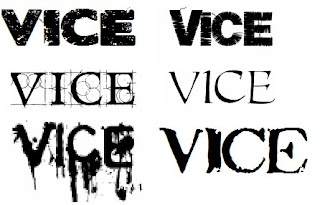
My favourite is the one in the top left corner, this is because it looks effective and will suit my genre of film, I also like the one in the top right as well, just not as much as the other one, the one in the top left is called 'blood sugar'. Because I like one nearly as the other I asked 10 people what was their favourite one. I only conducted the test on the top two though because I will definitely use one of them two.
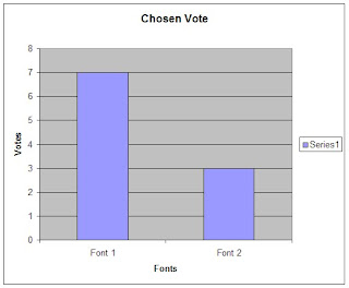
I have decided that I will use font 1 for my title and font 2 for my slogan as I like both of the font styles.
Thursday, 30 September 2010
Slogan.
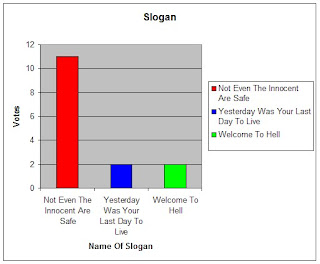
After some feedback from my titles I have decided that my title of 'Not Even The Innocent Are Safe' would be better as a slogan rather than a title, I also tested a few other slogans just incase other people felt that they were stronger than 'not even the innocent are safe'.
1. Not even the innocent are safe.
2. Yesterday was your last day alive.
3. Welcome to hell.
To decide on which slogan to have I carried out some feedback from different people, I already know my favourite slogan and I want to see if anyone else agrees.
Becky Mahan
I really like number 1 because I think that it links in well with the genre that he has chosen. I think that it is short and snappy and will catch the audiences eyes well if the colour and font are chosen well.
Nick
Number 1 is by far my favourite as it sounds a very good slogan, it is catchy and it links to the theme of the film.
Ben
The first of the slogans is my favourite because it supports the the title and the genre of the film, my least favourite is Welcome To Hell, for the simple reason that it seems a bit simple and doesn't relate to the film as well as the others.
Overall I asked 15 people to rate my slogans and placed the results in the table shown below.

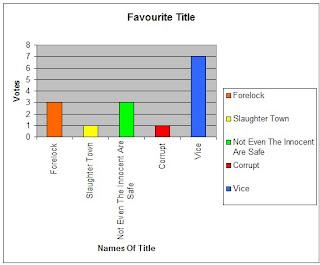
Movie Titles.
1. Forelock.
2. Slaughter Town.
3. Not Even The Innocent Are Safe.
4. Corrupt.
5. Vice.
These are the 5 titles that I have chosen and will now conduct feedback to find which is the most popular name.
Becky Mahan
I like number 2 the best because i think that it represents the genre very well. I also think that it is the best one out of the 5 because it sounds mysterious and intriguing. I don't like number 5 because I don't think it fits with the genre.
Nick
My favourite is number 5 because it sounds like a horror film and the name is quite catchy, I also like number 3 as it also sounds catchy, my least favourite is number 2 because it doesn't sound authentic.
Ben
I like number 1, 4 and 5 equally, simply because they are one word, which will appeal to the audience. Number 3 is also good but it sounds more like a slogan or a catchphrase rather than a title for a film, my least favourite is Slaughter town because it sounds a bit childish.
Overall I asked 15 people of their opinions and placed the results in a table.

Basic Plot Summary.
1. Group of friends go out to the grange together.
2. One notices that someone has been following them for a while.
3. They decide to run, fearing the worst. The person still just walks.
4. They think they loose him but they dint. Its as if there is more than one thing after them.
5. Only one friend gets away, who immediately notifies the police and family.
6. Each of them fear the worst as they are tied up in the back of the truck.
7. They are taken to a garage far away in a baron deserted area.
8. Each of them have tape strapped over there mouths and are each strapped down to chairs.
9. The creatures then begin to commit horrid offenses to these friends with different tools.
10. They friends hold on to their lives in hope that they will be saved.
11. Police then arrive with the other boy and attempt to kill this or these men.
12. The other boy is then taken hostage by one of the other creatures, who threatens the police with his and the others death.
13. One of the other boys notices a tool left next to him and throws it at one of the men.
14. The police storm in and quickly kill the 3 men inside.
15. No-one notices that there was another maniac who was now stood behind them who begins to spray bullets at everyone and then at himself killing more innocent police in the process.
16. Boys taken back home to parents.
Ideas For Magazine Cover
I want my magazine cover to be quite conventional, this is because the conventional layouts obviously work as many magazine companies have been successful such as Empire. I will also try and use one main image so it links to my poster and again I think this style is the most successful, however it will be lighter than my poster as it needs to attract the audience. Overall I will try and mix different ideas from exsisting magazine covers and put them into mine, this is because I know these ideas work and I dont want to just use one design as that would be copying.
Ideas For Poster
I want my poster to be quite dark as a whole, this is so it links to the theme of horror well and will make it look professional. I will also want to use one main image that stands out, this is so it catches the attention of the audience, and make them want to watch the film, which is the main aim of the poster. I will also include the actors names on the poster, again this could influence my target market in watching the film itself. I also want my trailer to represent my film and tell a stroy in itself again to send a message to the audience.
Ideas For Trailer
From the film trailers that I have looked at I have seen many different techniques that I could use in my own trailer, the main one being the writing, (the narrative) that almost splits up the scenes and creates a sense of fear. This is something that I will try and duplicate in my own work. Another technique that Imay use is that of the flickering images at the end of the trailer to enhance the tempo and again create a sense of fear. Looking at these trailers has given me different options that I could use to improve my trailer.
Paranormal Activity Trailer.
This is the Paranormal Activity trailer, I have used this because of the different effects within the trailer. The thing that I like most about this trailer is the way that it creates a sense of fear easily. The other key technique used in the this trailer is the fact that it is constantly dark, at no point is there any sign of lightness, which really gives the viewer a sense of the film and of the horror. Again like most trailers it uses a mixture of quick and longer cuts, which suits the genre perfectly.
28 Days Later Trailer.
This trailer also shows different techniques that I could use in my trailer. One of the things I really like about this trailer is that of the fonts. I like the amount of times the font is used at the start of the trailer and the effect it has. This technique is one that I will try and use in my own trailer because it emphasizes the theme of horror for the trailer. I also like the use of quick and long cuts and how they are both used equally, they both have great effects and create the sense of horror.
Sunday, 26 September 2010
Sunday, 19 September 2010
Wolf Creek Trailer.
This is one of the trailers from the film 'Wolf Creek', which is a horror film. I chose to analyse this film because of the different and interesting techniques used in the trailer throughout. The first technique that I may try and duplicate is that of the switch of themes, the first half of the trailer was happy and relaxed, with the sun out and people having a good time, but as soon as it becomes night it all changes showing a quick change of the theme. I like this effect as it shows contrast which I want in my trailer. Another technique I liked was towards the end when the scenes moved much quicker than at the start, showing that they are in great danger and are scared for their lives, this is shown by the frantic soundtrack (compared to the quite, peaceful soundtrack at the start) and the transition of the trailer. Again this is a technique I would use in the second half of the trailer to again show that there are two sides to the film. At the end of the trailer the title of the film comes up, and just after that it shows a slogan and one more clip, this will be very similar to my ending as I think it is really effective to leave the audience clipped to the trailer with a slogan that will shock them, as it does it this trailer.
Tuesday, 6 July 2010
Halloween II Trailer
This is the Halloween trailer, I have chosen to research this because of its genre and the many different techniques that would be useful to include in my own trailer, it starts with someone in the distance at night, this creates a real sense of eeriness as we don't know who this person is. You then see a closer view of this person with a gun in her hand and she is also looking a real mess, as though she has been chased or injured, which is electrified with the police man coming to see how she is, this shows that there is something wrong. You then see many more people in great pain and danger, again it creates suspense as we don't know why or how. The empty hospital is used to show that the woman is alone and in great danger still. You then finally see the killer, and then the soundtrack really kicks in as she hobbles away, the killers face is still dark, to show evil and we still don't know who it is. Another clever technique that I like is when the woman looks in the mirror and then sees the reflection of the killer in the mirror and then screams. Then the woman runs away and this starts the soundtrack again, another useful technique, finally the font style and colours, they are red and suit a horror film which is another good technique that I will use, this is a very useful trailer for research and will be helpful in creating my trailer.
Tuesday, 29 June 2010
Saw VI Trailer.
This is the Saw VI trailer, I have chosen to research this trailer because it is of the genre that I have chosen and has some useful techniques, such as the camera moving backwards throughout to show the scene, which is also common to the Halloween trailer. Also it constantly shows people in pain for a very shot period of time, showing their facial expressions and items of torture, this creates a great deal of suspense. There is also a constant soundtrack to increase the tension and it also shows the genre of the film. The fonts used are constant throughout which shows consistency and most of the fonts include the number 6, which links to the title of the films, this is a clever technique and one which I would try and replicate if possible.
Monday, 28 June 2010
Research and Genres.
Throughout the project I will intend to create a Digipack, which will include my movie trailer, poster and the DVD cover. At the moment there is only a couple of genres that I intend to use, these being either a Thriller or Horror. I will look at different films in these two genres and then decide which one I find the best to use and pursue.
Thriller films I could look at include: The Godfather, Shifty and The Dark Knight.
Horror films I could look at include: The Saw collection, Scream, Halloween, ect..
With these films I will also need to find a suitable soundtrack for parts of the trailer to create suspense and enhance the trailer, I will use Garage bands to find different artists within which would suit the genre of the film that I choose to take forward.
As I go through the project I will find different trailers that suit what I want to do in my trailer, and I will research them as well as these listed here. I also intend to use YouTube to find different amateur movie trailers for other students that have done movie trailers for their A level, I think this would be very useful to see different techniques used that are accessible.
Wednesday, 23 June 2010
Wordle

This is my wordle, which includes the two genres of film that I will be using, horror or thriller, it also shows some films of these genres and some scenes used in horror or thriller films, this is useful for when I need ideas as some are stored here.
Monday, 21 June 2010
Schedule
This is a rough schedule, showing when I expect to have different products or areas completed by, if I can keep to this schedule then I will time to improve my work so I can achieve as high a grade as possible.
- Complete research (existing products/audience) by 24th July.
- Complete planning (scripts, shot lists, storyboards, animatics, mock-ups and flat plans ect..) by 10th September.
- Complete rough-cut by 20th September.
- Complete final-cut by 1st October.
- Complete album/poster completed by 15th October.
- Final album/poster completed by 31st October.
- Audience feedback by 10th November.
- Revisions by 20th November.
- Evaluations by 30th November.
- 1st hand-in 1st December.
Introduction
Hello, my name is Christian Percival and this is my Media Studies A level blog and I go to Biddulph High School. I am going to do a movie trailer as I have a couple of decent ideas for a movie trailer and it seems to be the most interesting of the two subjects, however I also have a good idea for a music video as well so if the movie trailer doesn't go to plan then I can always fall back on that. I have also picked to do movie trailers because there are many different trailers that I like such as the James Bond Casino Royal trailer.
Subscribe to:
Comments (Atom)